Ever marveled at how certain apps and websites just draw you in the moment you lay eyes on them? Well, it’s not just happenstance; it’s the enchanting dance of color psychology at play. Let’s take a plunge into the mesmerizing world of colors and uncover how their strategic use can wield immense influence in shaping user experiences.
Section 1: Decoding Color Psychology in Design
1.1 The Essentials of Color Psychology: At its core, color psychology is the art of understanding how different colors can trigger emotional responses and influence human behavior. In the realm of design, it’s about harnessing this power to create interfaces that resonate with users on a deeper level. Colors aren’t just visual elements; they’re mood-setters and emotion-conveyors.
1.2 Color Theory in UI Design: Now, let’s talk about the nitty-gritty – color theory in UI design. It’s not just about picking your favorite hues; it’s about creating harmony and contrast, ensuring that the color palette communicates the intended message. From analogous to complementary schemes, each choice plays a role in shaping the user’s perception and experience.
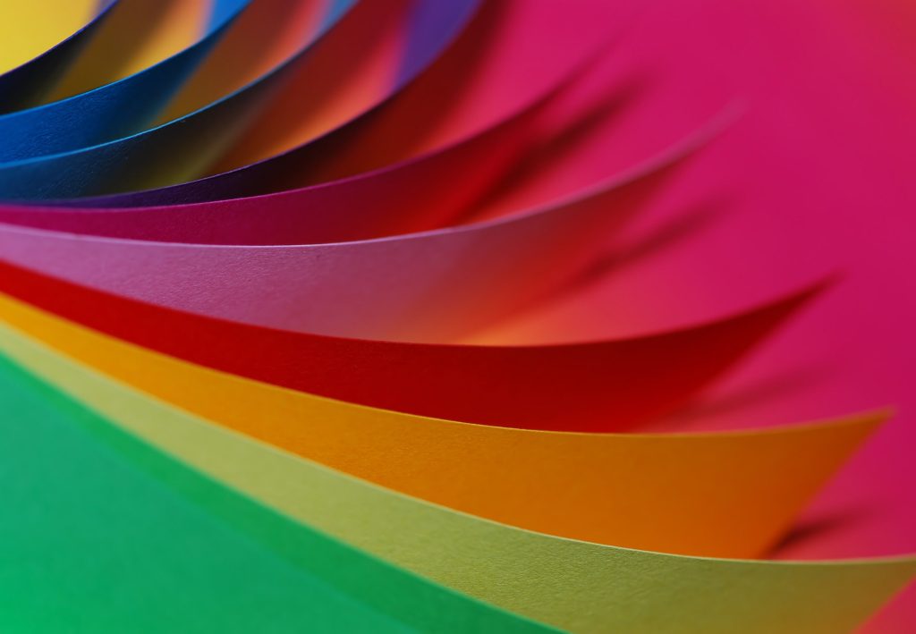
1.3 Emotional Impact of Design Colors: Colors are like silent storytellers, whispering emotions and setting the tone for user interactions. Warm tones like reds and oranges may evoke feelings of excitement and energy, while cool blues and greens can bring a sense of calmness and serenity. Understanding this emotional impact is key to designing interfaces that connect with users on a visceral level.
Section 2: User Interface Color Schemes Unveiled
2.1 Crafting a Visual Identity: Choosing the right color scheme is akin to defining a product’s personality. We’ll explore how designers use color schemes to convey brand identity, establish visual consistency, and create a cohesive user experience. It’s not just about making things pretty; it’s about creating a memorable and recognizable brand presence.
2.2 Navigating the Palette: Ever wondered why social media platforms use calming blues? We’ll uncover the psychology behind color choices in popular apps and websites. From the warmth of red notifications to the trustworthiness of blue links, each color serves a purpose in guiding user behavior.
Section 3: Impact on User Behavior and Perception
3.1 The Call-to-Action Conundrum: Colors play a pivotal role in directing user actions. We’ll delve into the science of call-to-action buttons, exploring how the color choice can influence clicks, conversions, and overall user engagement. It’s a subtle yet powerful way to guide users through their digital journey.
3.2 The Role of Accessibility: Inclusivity matters. We’ll touch upon the importance of considering color accessibility in design, ensuring that interfaces are user-friendly for everyone, including those with visual impairments. It’s a crucial aspect of responsible and thoughtful design.
Section 4: Best Practices for Harmonious UI Design
4.1 Creating Balance: Balance is key in UI design, and colors play a starring role. We’ll discuss how to strike a harmonious balance between vibrant and neutral tones, ensuring that the design remains visually appealing without overwhelming users.
4.2 Evoking the Right Emotions: Different contexts call for different emotions. Whether it’s the soothing tones of meditation apps or the vibrant hues of gaming interfaces, we’ll explore how designers choose colors to align with the intended user experience and emotional response.
Colors are powerful tools that can influence moods, guide interactions, and shape the overall user journey. So, the next time you’re mesmerized by an app’s color palette, know that it’s a well-thought-out orchestration of emotions and experiences. Happy designing!